Guest post, by Parinda Sakdanaraseth
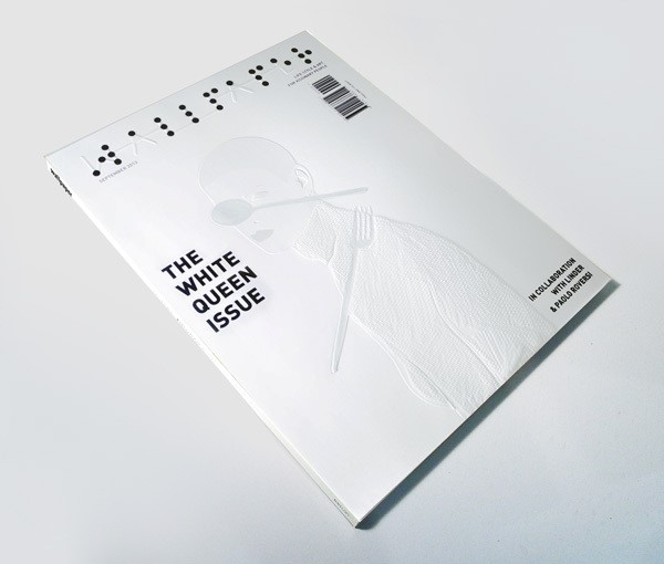
Figure 1: A tactile-visual re-imagining of ‘Wallpaper’ magazine. Image credit: Parinda Sakdanaraseth.
I am fascinated by the sense of touch. With my background in Graphic Design, I feel a joy in using the little power I have to experiment and play with different kinds of paper to create rich textures for publications. Paper, whether smooth, rough, eggshell-like or matte, can create almost infinite outcomes when combined with printing techniques for us to experience through both seeing and touching. In this ‘Thinking Piece’, I describe how my interest in this area led me to create ‘Touch Project’, an experimental design series that aimed to create a ‘common language’ for communicating to both visual and visually impaired users, by integrating visual and tactile graphic design techniques.
‘Touch Project’ evolved from a piece I created for a publication module on my Graphic Design BA at Chulalongkorn University. I was given a brief to re-imagine the magazine ‘Wallpaper’ for a new target group. I chose to focus on visually impaired users as I thought it would be interesting to play with the idea of a ‘visual-heavy’ magazine. To meet the project’s 4-week timescale, I created a magazine spread that used embossing techniques to outline and ‘puff up’ visual imagery. I added further textures, for example, using glossy varnish to paint some parts of the illustration to mimic the feel of metal.
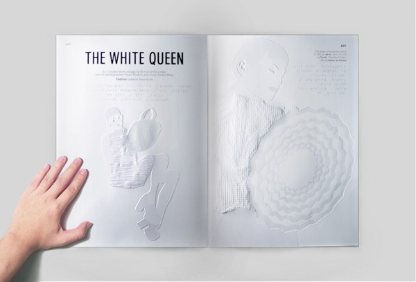
Figure 2. A re-imagined spread for ‘Wallpaper’ magazine, designed with embossing techniques for visually impaired users. Image credit: Parinda Sakdanaraseth.
In the next stage, I began by creating random graphic patterns. Some were simple, made up of dots and lines. Others were quite messy as I tried to mimic textures from nature. In the next step – turning the visual tactile – I used ‘puffed colour’ a common screen-printing technique used on T-shirts. After the colour dries, it is heated with a high-intensity heat gun, and ‘puffs up’ to create a highly tactile texture. I applied this technique to 35-pattern pieces on a single screen.This short project ignited my interest in the possibilities of texture and how it affects perception, particularly for visually impaired users. I decided to spend another whole year developing this concept as part of the final degree project for my BA.
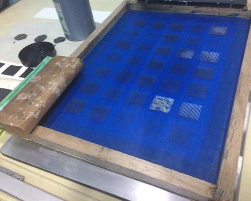
Figure 3. Screen block for my set of 35 tactile pattern pieces, created using a puff colour technique. Image credit: Parinda Sakdanaraseth.
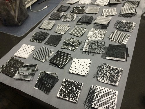
Figure 4: Finished tactile pattern pieces. Image credit: Parinda Sakdanaraseth.
With the support of the Thai Blind Association, I then facilitated a workshop with a small group of four visually-impaired participants. Two had low-vision, and had lost much of their sight when they were teenagers. The other two had been completely blind since birth. The workshop aimed to explore the tactile pattern pieces by asking participants to describe which emotions they experienced or associated with each piece.
Many interesting points emerged from the discussions. In particular, the experience of visual and tactile perception was connected to the degree of visual impairment the participants experienced. The low-vision participants, who had previously experienced sight and could still perceive blurry shapes and colours, were able to visualise the object that they touched in a contour form, in the same way people without visual impairments might. These participants were also able to perceive additional tactile details. For example, in another exercise, I asked participants to draw a human body, using a special tool that allows the visually-impaired user to draw with a thread. They accurately created a contour and then layered additional textural details to each part, such as the ‘silkiness of the hair’ or ‘softness of the cotton shirt’.
The fully-blind participants perceived the tactile pieces very differently. They paid more attention to the spatial aspects of the patterns created by the puffed colour technique. For example, in the exercise where they were asked to draw a human body, they applied the thread tool to create a low-relief textural form rather than an outline.
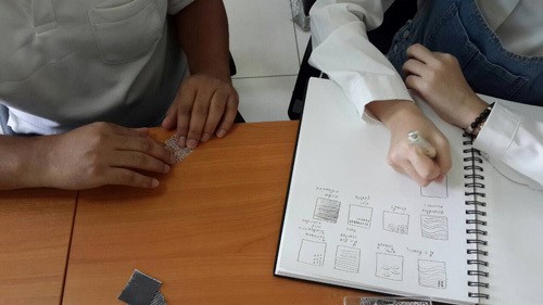
Figure 5: Interviewing Lookpla, a visually impaired participant. Image credit: Chitta Janrassameewilai.
In the next stage of my project, I choose to work with one of the fully-blind participants, a Fine Art student called Lookpla. I thought her artistic knowledge might help draw out and illuminate some of the links between emotions and tactile patterns. During this session, I handed her the textured pieces one at a time. As she touched each one, she told me if the piece held positive or negative associations, and which emotion it reminded her of. She gave me a different answer for each of the 35 pieces and was able to recall precisely all the pieces she had touched. It was interesting to observe some of the overlaps between myself as a visual ‘user’ making associations with the eyes and Lookpla as a visually-impaired ‘user’ making associations through the hand; for example the two patterns shown in Figure 6 below were identified by both of us as ‘confused’ and ‘calm’.


Figure 6: Left: The pattern consisting of randomly patterned dots interpreted by both of us as ‘confused’. Right: The pattern interpreted by both of us as ‘calm’.


Figure 7: Some of the results showing the relationship between tactile-visual textures. Left: positive, Right: negative. Image credit: Parinda Sakdanaraseth.
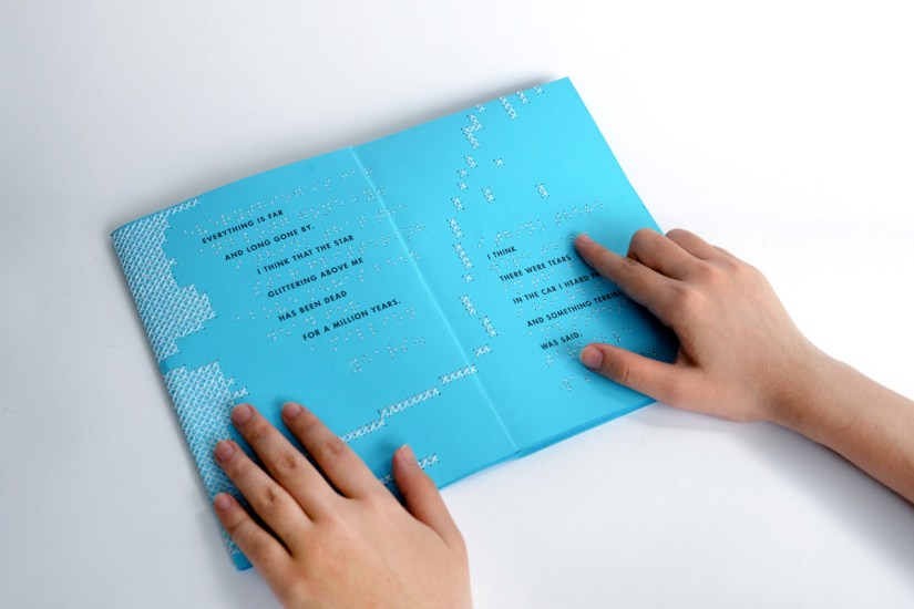
As the final outcome, I decided to create a series of four booklets, which experimented with various techniques able to provide both visual and tactile layers. I chose Rainer Maria Rilke’s Poems from ‘The Book of Image’ as a storytelling medium and picked 2-3 tactile patterns to illustrate the emotions and associations for each story.

Figure 8: The first booklet ‘Fate’, using the ‘puffed-colour’ screen printing technique. Tactile patterns featured include ‘Insecure’, ‘Even’ and ‘Discontinued’. Image credit: Parinda Sakdanaraseth.
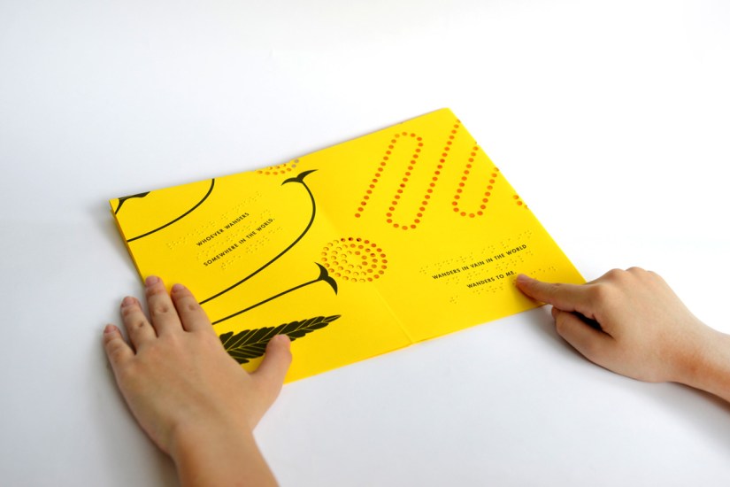
Figure 9: The second booklet ‘Friend’, using a paper-cutting technique. Featured patterns include ‘Sad’, ‘Nervous’ and ‘Smooth’. Image credit: Parinda Sakdanaraseth.
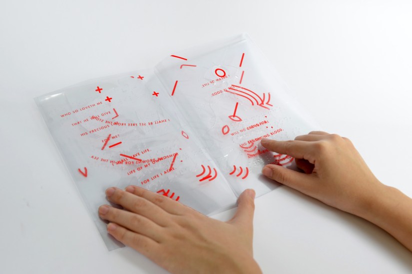
Figure 10: The third booklet ‘Love’, used embossing techniques on translucent film. Textile patterns included ‘Lonely’, ‘Frustrated’ and ‘Happy’. Image credit: Parinda Sakdanaraseth.